Pixabay
This project presents a mobile app redesign concept for Pixabay, addressing user feedback to improve UX/UI. Inspired by Pexels and Unsplash, the redesign aims to increase user satisfaction and enhance Pixabay's competitive standing.
Mobile App Design
User Research
Design System
Problem
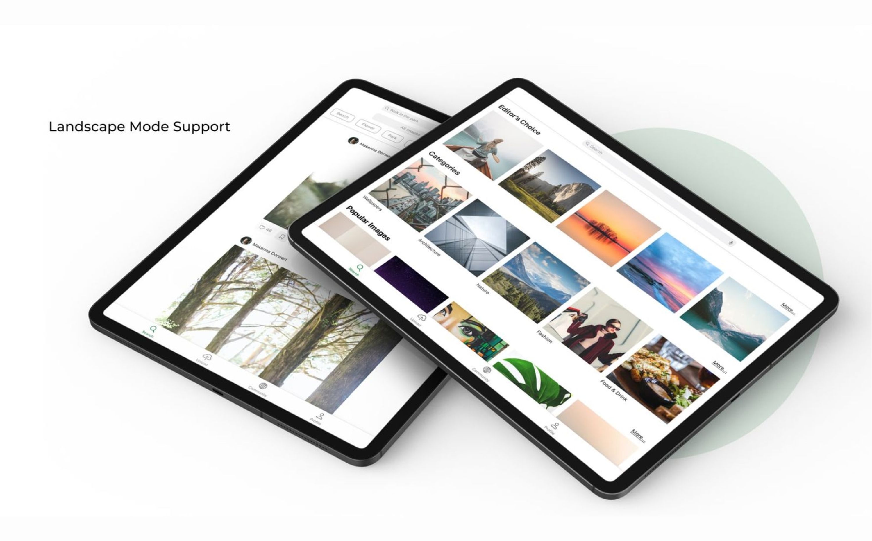
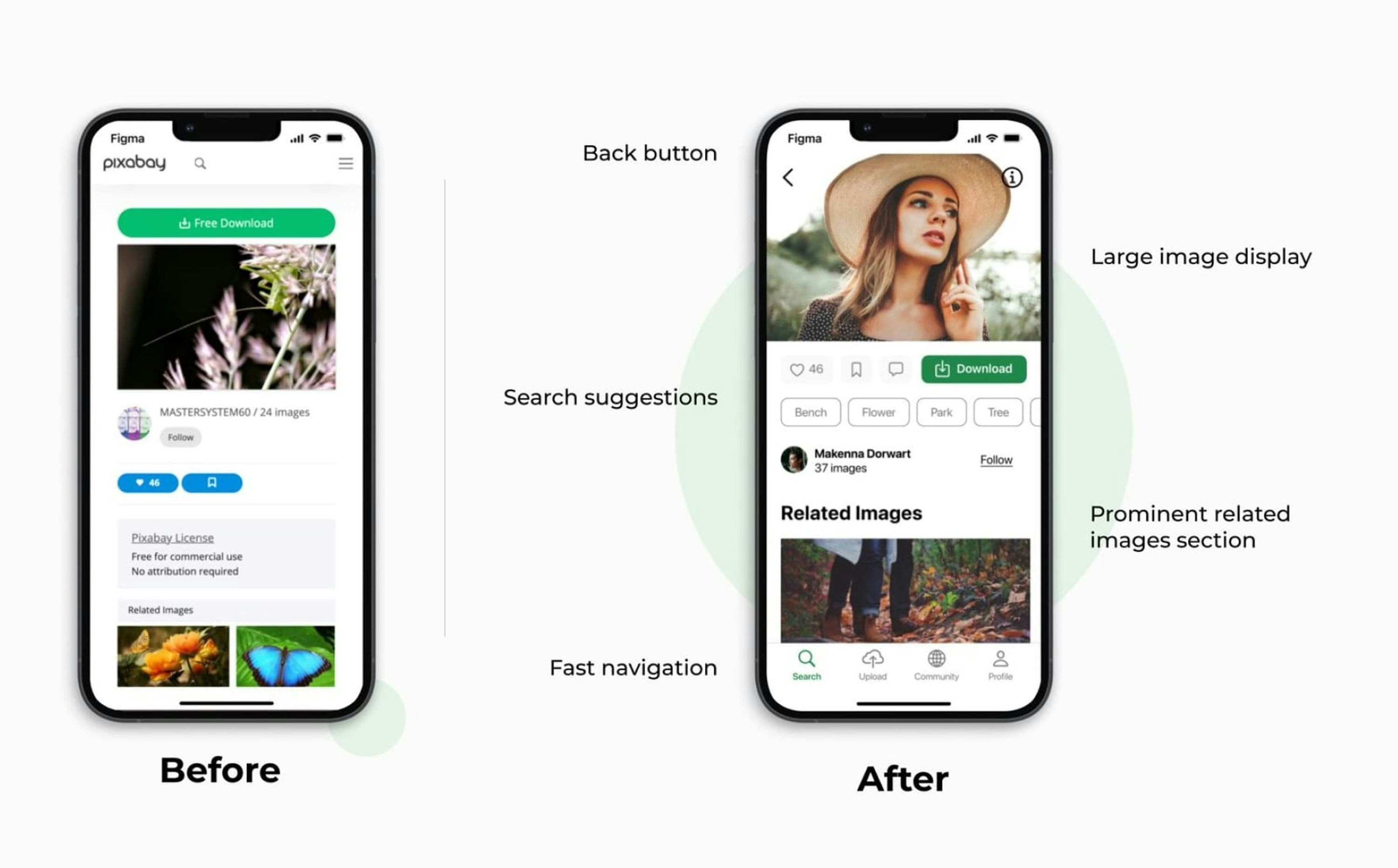
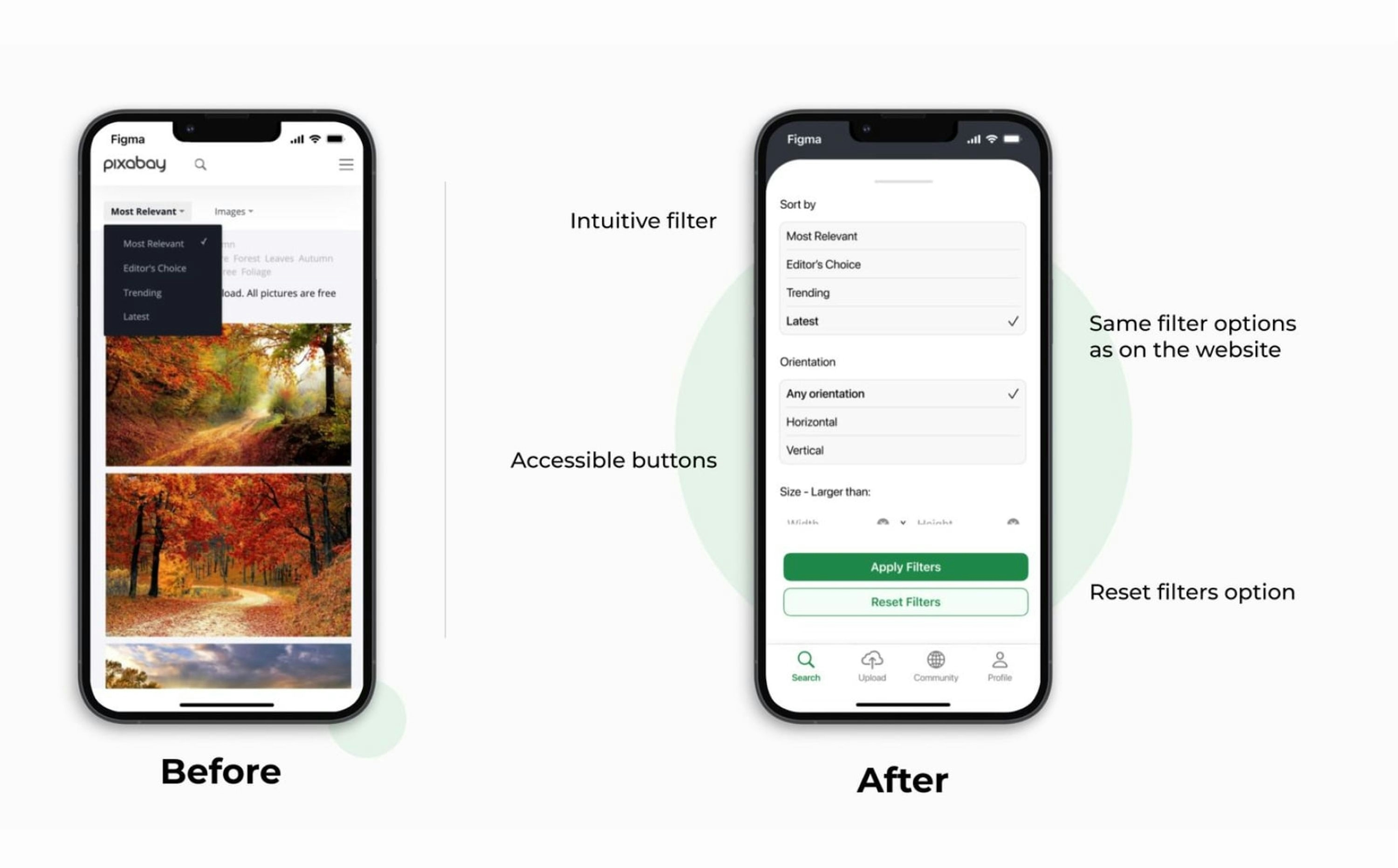
Pixabay's existing mobile app, a direct port of their website, suffers from poor usability and a lack of user-friendly design, leading to negative user feedback. Key issues include an unintuitive interface, "clunky" navigation, missing landscape mode, and limited category selection.
Impact
This redesign concept aims to address these issues and elevate the Pixabay mobile app, resulting in:
- Increased User Satisfaction: By providing a more intuitive and enjoyable user experience.
- Higher App Downloads: Attracting more users with an improved mobile app presence.
- Enhanced Professional Standing: Positioning Pixabay as a more competitive and professional platform in the stock photo industry.
Solution
This showcase presents a redesign concept for the Pixabay mobile app, drawing inspiration from industry leaders like Pexels and Unsplash, focusing on improved UX/UI.
- User Research Insights:
- Extensive review of user feedback, wishlists, and online reviews revealed key pain points: unintuitive navigation, clunky interface, lack of landscape mode, and limited categories.
- A comparative analysis with Pexels and Unsplash, including user interviews and naturalistic observation, highlighted best-in-class features such as:
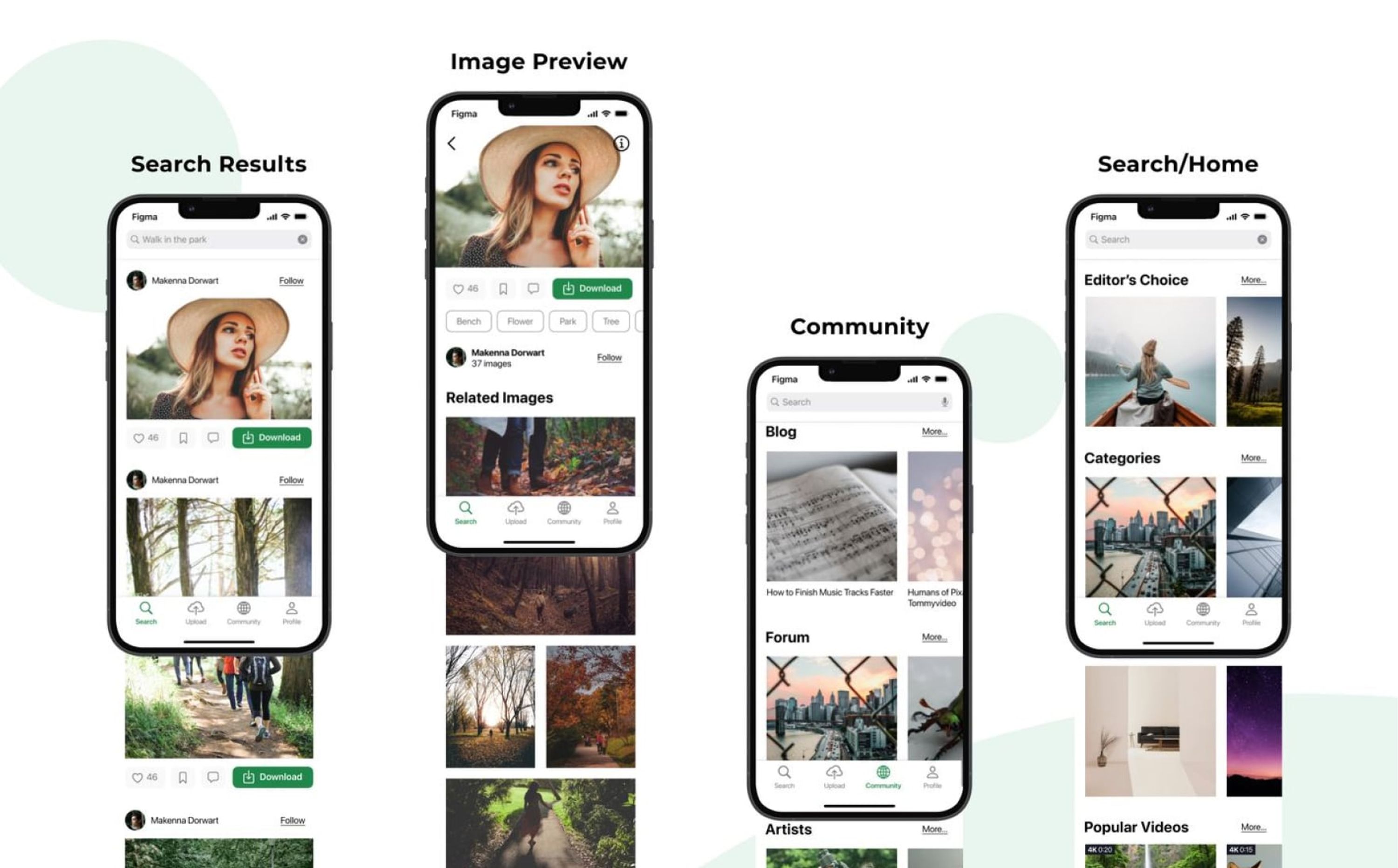
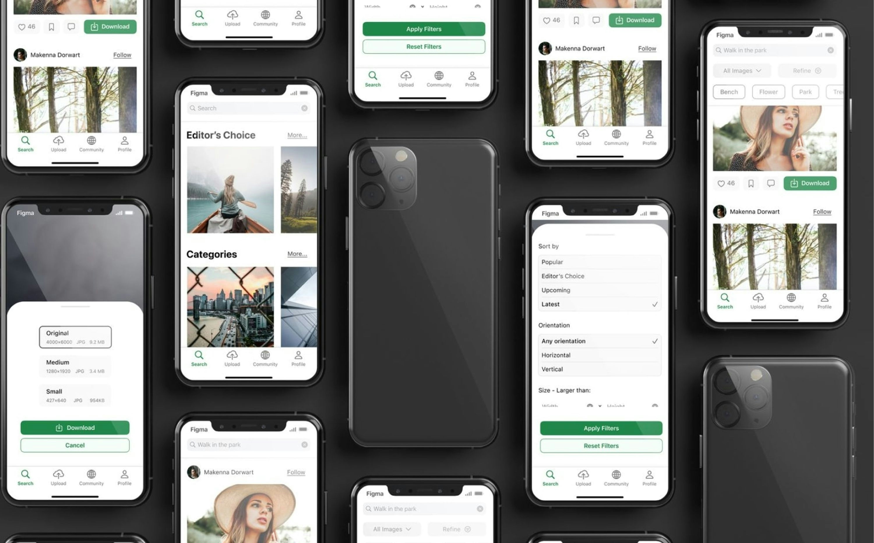
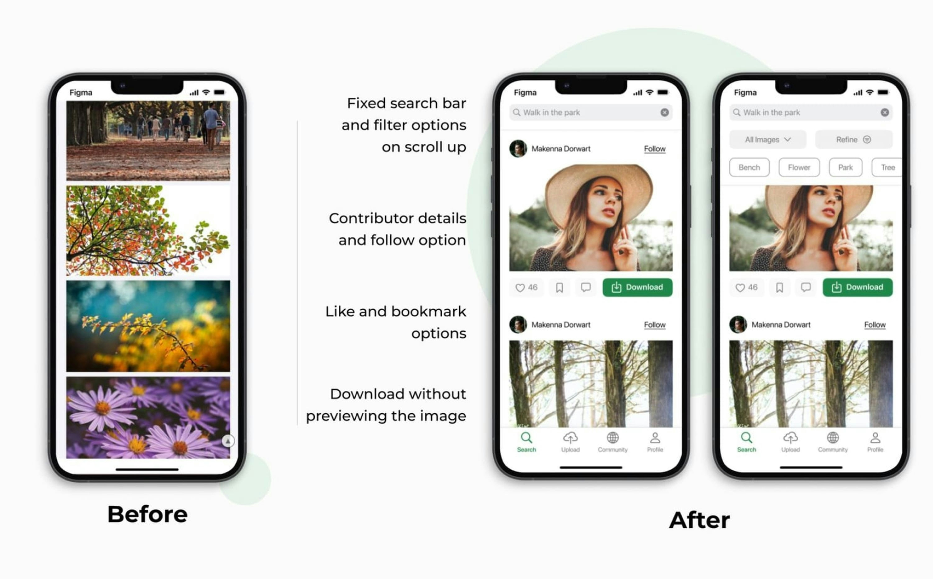
- Easy navigation and intuitive interface
- Effective image filtering and search suggestions
- Clear display of contributor information
Key Design Improvements
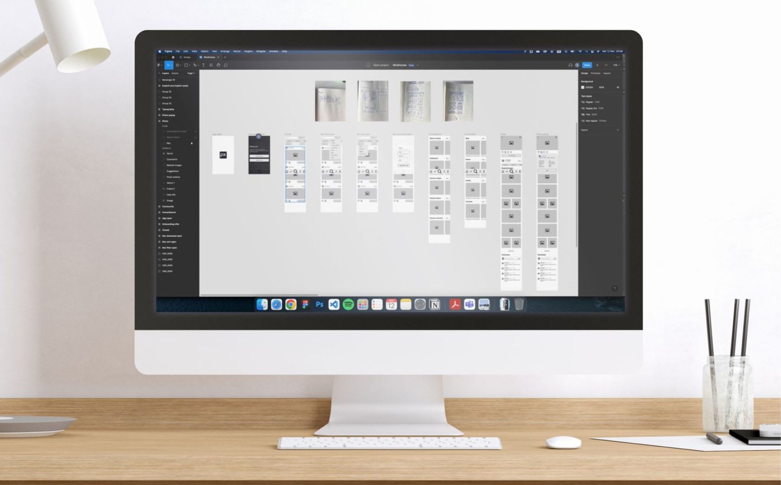
- Sketches and wireframes were created based on the research, focusing on addressing the identified user needs.
- The design adheres to Pixabay's existing brand identity, while incorporating mobile UX/UI best practices and Apple's Human Interface Guidelines.
My Role
In this project, I was responsible for:
- Conducting user research, including gathering user reviews, conducting user interviews, and performing naturalistic observation.
- Analysing user feedback and identifying key pain points.
- Performing competitive analysis of Pexels and Unsplash mobile apps.
- Developing sketches, wireframes, and a high-fidelity design concept for the redesigned Pixabay mobile app.